acne studios launches permanent gallery space in paris with exhibition by paul kooiker

acne studios launches its first permanent art space in paris


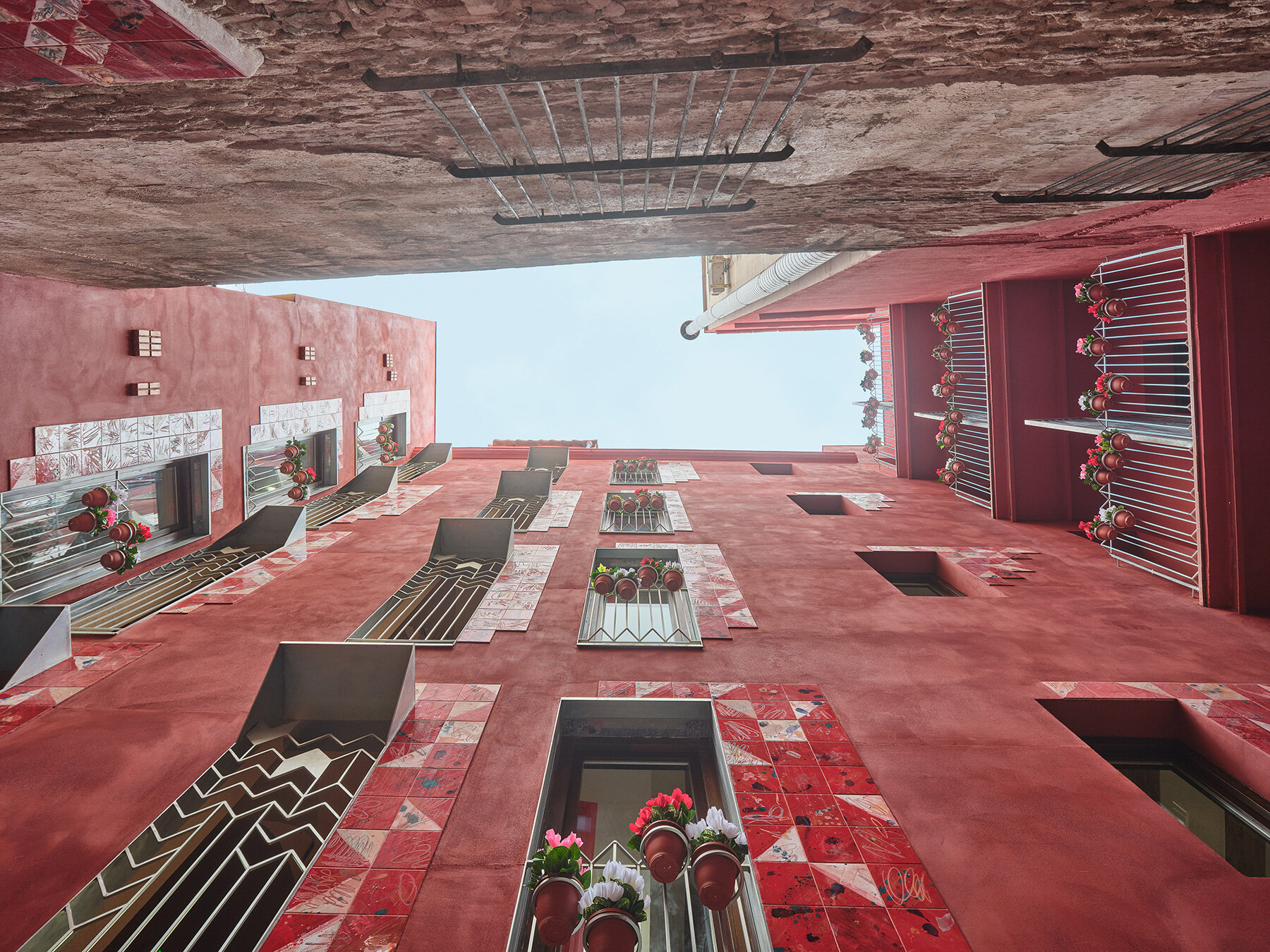
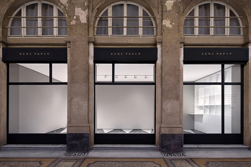
Acne Studios unveils a new permanent gallery space in Paris, Acne Paper Palais Royal, with ‘2025’, a solo exhibition by photographer Paul Kooiker on view through July 27th, 2025. Located at 124 Galerie de Valois, beneath the historic arcades of the Palais Royal and overlooking its iconic gardens, the space marks a significant chapter for the Swedish fashion house as it extends its presence beyond fashion into the realms of art, exhibitions, and cultural events.


images courtesy of Acne Studios


from magazine to life


The gallery is named after Acne Paper, the biannual magazine of the Stockholm-based house, featuring fashion, art, design, and writing. Much like the magazine, this new space is designed to host a mix of creative content that spans from art shows and photography exhibitions to talks, book signings, and cultural events. It’s intended as a space for dialogue and experimentation, where both well-known and emerging artists can share work and ideas.


The first exhibition at Acne Paper Palais Royal will feature new works by Dutch photographer Paul Kooiker, known for his unusual, stylized images that often explore the human body in surreal or theatrical ways. This choice fits well with Acne Studios’ visual identity and its longtime interest in photography and conceptual image-making. Since its founding in 1996 in Stockholm as a multidisciplinary collective, Acne Studios has treated fashion as just one part of a larger creative practice. This gallery in Paris reinforces that approach, placing the brand in one of the most iconic cultural locations of the city.


2025 by Paul Kooiker is on view through July 27th, 2025


2025 photographic exhibition by Paul Kooiker


Paul Kooiker’s 2025 photographic exhibition, on view through July, 27th, 2025, gathers forty-two portraits of art students from Amsterdam’s Gerrit Rietveld Academie, offering a sharp yet nuanced meditation on the ambivalence of young adulthood. While formally echoing the conventions of school portraiture, Kooiker’s images resist nostalgia and instead document a generation caught between uncertainty and resilience.


Each portrait stands as a rite of passage and a snapshot of emotional ambiguity. The familiar format, head-on, tightly framed, and meticulously lit, serves as a canvas for psychological tension. These are not celebratory tokens of academic progression but rather open-ended reflections on a volatile moment. The students’ expressions, neither entirely hopeful nor wholly anxious, channel the complexity of a world where optimism is tempered by crisis.


forty-two portraits of art students from Amsterdam’s Gerrit Rietveld Academie are on display


a sharp yet nuanced meditation on the ambivalence of young adulthood


each portrait stands as a rite of passage and a snapshot of emotional ambiguity 


Acne Studios opens a new permanent gallery space in Paris


the gallery opens to the public on June 26th, 2025


the first exhibition at Acne Paper Palais Royal will feature new works by Dutch photographer Paul Kooiker


a major step for the Swedish fashion brand


the gallery is named after Acne Paper, the biannual magazine of the brand | via @acnestudios


the students’ expressions channel the complexity of a world where optimism is tempered by crisis


project info:


name: Acne Paper Palais Royal

brand: Acne Studios | @acnestudios

location: 124 Galerie de Valois, Palais Royal, 75001 Paris, France

opening date: June 26th, 2025


inaugural exhibition: 2025
photographer:
Paul Kooiker | @paulkooiker
dates: June 26th – July 27th, 2025

The post acne studios launches permanent gallery space in paris with exhibition by paul kooiker appeared first on designboom | architecture & design magazine.

slender steel bridge with integrated net seating expands over foša port in croatia

steel Bridge over Foša Links Heritage and Public Space


Located within the UNESCO World Heritage Site of Trogir, Croatia, the Bridge over Foša is a contemporary pedestrian structure that connects the city’s historic core with Fortin Park across the sea channel. Designed by Prostorne Taktike, the bridge serves both infrastructural and social functions while responding to the site’s maritime and urban context.


The bridge’s form follows an asymmetric hyperbolic paraboloid geometry, resulting in a slender steel shell structure with variable cross-sections. This shape minimizes visual obstruction, preserving views of the city’s heritage landmarks. Its highest point acts as an unobtrusive threshold, maintaining the visual integrity of the old town.


all images by Darko Škrobonja


Prostorne taktike draws from Trogir’s shipbuilding heritage


For the bridge’s structure, the design team at Prostorne taktike draws from Trogir’s shipbuilding heritage. The internal caisson system, made from flat steel plates, echoes the double-bottom construction method commonly used in shipbuilding. Prefabricated as a single unit in a nearby shipyard, the entire bridge was transported by barge and installed onto pre-prepared abutments within one day. This off-site fabrication approach reduced disruption in the dense urban area while showcasing local industrial expertise.


Material selection and finishes were guided by considerations of durability and contextual relevance. The exterior is coated with a three-component system containing metal powder, allowing the surface to gradually develop a rust-like patina similar to Corten steel. This finish offers both aesthetic consistency and long-term protection.


the Bridge over Foša connects Trogir’s historic core with Fortin Park


Bridge over Foša integrates Seating, Movement, and Views


The pedestrian experience was carefully considered in the design. A staircase follows the bridge’s gentlest gradient, with tread materials selected to ensure safety and comfort. A combination of rubber and fine stone aggregate provides a stable walking surface in the stair zones, while softer rubber is used elsewhere for added comfort. On the north side, informal seating zones are integrated into the steeper sections, encouraging use beyond circulation. Facing Fortin Park, the bridge incorporates perforated steel panels fitted with a net. This intervention creates spaces for sitting and gathering, while visually connecting the upper and lower areas of the site. The perforation reduces visual weight and enhances the spatial relationship between the bridge and its surroundings.


The design and execution of the Bridge over Foša prioritize structural efficiency, environmental responsibility, and urban sensitivity. The use of locally sourced and recycled materials, combined with efficient fabrication and installation methods, helps reduce the project’s ecological impact. As a result, the bridge integrates contemporary engineering with historical awareness, contributing a new layer to Trogir’s evolving urban landscape.


the structure follows an asymmetric hyperbolic paraboloid geometry

trogir-croatia-bridge-over-fosa-prostorne-taktike-designboom-1800-3

its slender steel shell preserves views of Trogir’s heritage landmarks


the material choice balances durability and contextual sensitivity


rubber and stone aggregate provide stable, slip-resistant walking surfaces

trogir-croatia-bridge-over-fosa-prostorne-taktike-designboom-1800-2

softer rubber zones enhance pedestrian comfort on non-stair areas


the exterior finish includes a metal powder coating that develops a rust-like patina over time


a pedestrian staircase follows the gentlest slope of the bridge’s curved form


the bridge incorporates perforated steel panels fitted with a net


the design incorporates recycled and locally sourced materials


steeper sections serve as stairs and informal seating zones for rest and gathering


the perforation reduces visual weight and improves spatial connection across levels


the bridge contributes to Trogir’s evolving urban landscape


Bridge over Foša creates places for sitting and interaction near Fortin Park


project info:


name: Bridge over Foša
architect: Prostorne taktike | @prostorne_taktike

design team: Luka Cvitan, M.Arch., Antonia Cvitan Vuletić, M.Arch.

structural engineer: Orlandini Projekt d.o.o.

location: Trogir, Croatia

photographer: Darko Škrobonja


designboom has received this project from our DIY submissions feature, where we welcome our readers to submit their own work for publication. see more project submissions from our readers here.


edited by: christina vergopoulou | designboom

The post slender steel bridge with integrated net seating expands over foša port in croatia appeared first on designboom | architecture & design magazine.

linear, unbroken wall encloses weekend villa by maanchitra in rural india

Maanchitra builds Silent Wall villa in Vadodara


Located on the rural outskirts of Vadodara, India, The Silent Wall is a weekend villa designed by Maanchitra that explores restraint, spatial sequencing, and material clarity. The project takes a deliberate departure from conventional farmhouse typologies by introducing a single, linear wall as the central architectural gesture. Standing at the site’s edge, the unbroken wall acts as both a visual and spatial threshold. It is neither a gate nor an enclosure, but rather a pause that defines entry. Taller and more prominent than its surroundings, the wall establishes a strong vertical mass that shapes the initial spatial experience, drawing focus and momentarily halting movement before transition into the house.


Beyond this threshold, the interior unfolds in a series of spatial transitions. Movement first passes through a compact, compressed foyer that regulates circulation before releasing into a linear grid of spaces. The living area is sunken, bringing the surface of the adjacent body of water into close visual alignment with the interior floor level. This relationship blurs the boundary between indoor and outdoor space. Private areas follow a clear linear organization, with verandahs and small courtyards positioned to mediate between interior rooms and the surrounding landscape. The architectural layout maintains a balance between openness and controlled enclosure.


all images by Himon Mukherjee


Silent Wall employs noble, unprocessed materials


Designers at Maanchitra opt for materials with elemental and unprocessed finishes. Rough-cut natural stone, untreated timber, and lime-washed surfaces define the palette. The design intentionally avoids synthetic finishes such as laminates and polishes, allowing the building materials to weather naturally over time. Surface imperfections and material aging are integrated as part of the design intent, contributing to the villa’s evolving character.


Interior elements, including artworks and handcrafted objects, are integrated into the building fabric rather than added as decorative afterthoughts. Niches, walls, and built-in features follow a consistent spatial rhythm that reinforces the architecture’s composition. The Silent Wall villa prioritizes slow spatial revelation, emphasizing sensory transitions between light and shadow, solid and void, interior and exterior. Circulation flows between shaded corridors, sunlit courtyards, and quiet water edges, encouraging an engagement with changing atmospheres throughout the day.


the architectural composition emphasizes controlled enclosure and openness


verandahs and small courtyards mediate between indoor spaces and the landscape


silent-wall-weekend-villa-india-maanchitra-designboom-1800-2

the wall acts as both a spatial and visual pause before entering the house


transitions between light and shadow define the interior atmosphere


built-in niches and wall surfaces integrate handcrafted objects and artworks


material choices include rough-cut natural stone and untreated timber


the layout follows a clear linear grid, balancing openness and order


a sunken living area brings the waterbody into close visual alignment with the floor level


water edges and reflective surfaces enhance indoor-outdoor connections


spatial rhythm is maintained through consistent alignment of interior elements


the design intentionally avoids synthetic materials and polished finishes


lime-washed surfaces contribute to the palette of unprocessed finishes

silent-wall-weekend-villa-india-maanchitra-designboom-1800-3

the Silent Wall remains visually anchored in its rural setting


project info:


name: The Silent Wall

architect: Maanchitra | @maanchitra_
design team: Ar. Milan Patel | @milanpate1999, Ar. Dutt Patel | @duttpatel108, Ar. Kinjal Zatakiya | @km_zatakiya, Ar. Parth Sheth | @sheth_11
location: Vadodara, India

photographer: Himon Mukherjee | @wtfhimon_
videographer: Sunny Parwani | @better.call.sunny


designboom has received this project from our DIY submissions feature, where we welcome our readers to submit their own work for publication. see more project submissions from our readers here.


edited by: christina vergopoulou | designboom

The post linear, unbroken wall encloses weekend villa by maanchitra in rural india appeared first on designboom | architecture & design magazine.

louis vuitton ship brings flagship and OMA-designed exhibition to shanghai

the louis opens in shanghai with oma-designed exhibition aboard


Louis Vuitton unveils The Louis, a monumental structure moored in Shanghai’s central business district. Resembling a modernist ship at anchor, the boat-like building brings together a multi-story flagship store, Le Café Louis Vuitton, and the brand’s Visionary Journeys exhibition, housed within a surreal facade of metallic Monogram hulls and stacked trunks. Located on Wujiang Road, The Louis honors Louis Vuitton’s maritime roots while anchoring itself in Shanghai’s historic identity as a port city.


Visionary Journeys, the multi-room exhibition spanning two floors, is conceived by Shohei Shigematsu of OMA. It opens with Trunkscape, an installation composed of Monogram canvas trunks that curve into an archway, evoking architecture and dreamscape. Originally shown in Bangkok and Osaka (find designboom’s previous coverage here), this iteration draws visitors into a cinematic voyage through Louis Vuitton’s intertwined history with design, innovation, and travel, from the 1859 workshop in Asnières to high-seas regattas and couture-bound steamer trunks. ‘Our installation uses iconic Louis Vuitton trunks in a playful display that intuitively and instantly communicates the Maison’s heritage and spirit of innovation,’ shares Shohei Shigematsu. ‘Conceived to fit the central atrium of the temporary store, the four trunk towers are part structural and part sculptural, familiar in materiality yet foreign in shape, height, and slenderness, created by their distinctly stacked forms. Together, they become a spatial amplifier that feels surreal yet rooted to Louis Vuitton’s origins.’


all images courtesy of Louis Vuitton


Louis Vuitton draws from transoceanic journeys


The Louis is a space created by Louis Vuitton that encapsulates the spirit of travel and the deep connection of the french house to movement, craftsmanship, and culture. Its design draws inspiration from transoceanic journeys, the kind once made by ocean liners, combining the shape of a ship’s prow with the form of a classic Louis Vuitton steamer trunk. The outside is covered in shimmering metallic Monogram patterns that reflect light like the surface of the sea, making the structure itself a symbol of travel and timeless design.


Inside, visitors are taken on a journey that includes food, shopping, and storytelling through exhibition. Each room is themed to reflect a different chapter in Louis Vuitton’s evolution through historic pieces and creativity.


Louis Vuitton unveils The Louis, a monumental structure moored in Shanghai’s central business district


an oma-designed journey through objects


This journey begins with Origins, a space that features the early designs of the house, reimagined with a contemporary touch. This room sets the tone for the rest of the experience, one that honors tradition while embracing innovation. Next is Voyage, which explores the more whimsical and personal aspects of travel through archival patents, stories from famous clients, and custom-made items. Olfactive Exploration focuses on fragrance and puts on display rare perfume bottles from as far back as 1927 alongside scents crafted by in-house perfumer Jacques Cavallier-Belletrud.


Moving on, Books and Sport shows how the brand functions as both storyteller and companion across many worlds. From Gaston-Louis Vuitton’s love of literature and publishing to its role in creating elegant trophy trunks for global events like Formula 1 and the Olympics. In Fashion & Leather Goods, the house’s creative metamorphosis takes center stage, spotlighting classic bags reinterpreted by artistic directors including Marc Jacobs, Virgil Abloh, and Pharrell Williams. Workshop and Testing pull visitors into the behind-the-scenes world of Louis Vuitton craftsmanship, where tools nicknamed Louise and Louisette help make sure that each piece meets rigorous standards. Perched on the third floor, Le Café Louis Vuitton brings a refined take on Shanghai-style dining, a fusion of East and West shaped by chefs Leonardo Zambrino and Zoe Zhou.


The opening of The Louis in Shanghai ties Louis Vuitton’s roots in travel to the role of the city as a longtime port of exchange, reflecting on how objects carry meaning over time.


resembling a modernist ship at anchor, the boat-like building brings together multiple uses


a surreal facade of metallic Monogram hulls


The Louis honors Louis Vuitton’s maritime roots


the project anchors itself in Shanghai’s historic identity as a port city

louis-vuitton-sail-shanghai-ship-flagship-exhibition-oma-shohei-shigematsu-designboom-large03

the design draws inspiration from transoceanic journeys, the kind once made by ocean liners


Visionary Journeys is the multi-room exhibition spanning two floors


the exhibition’s design is conceived by Shohei Shigematsu of OMA

louis-vuitton-sail-shanghai-ship-flagship-exhibition-oma-shohei-shigematsu-designboom-large02

Trunkscape is composed of Monogram canvas trunks that curve into an archway


Olfactive Exploration puts on display rare perfume bottles


Books and Sport shows how the brand functions as both storyteller and companion across many worlds

louis-vuitton-sail-shanghai-ship-flagship-exhibition-oma-shohei-shigematsu-designboom-large01

Origins features the early designs of the house


the behind-the-scenes world of Louis Vuitton craftsmanship


Origins sets the tone for the rest of the experience


project info:


name: The Louis

brand: Louis Vuitton | @louisvuitton

architect: Shohei Shigematsu / OMA | @omanewyork, @shohei_shigematsu

location: Wujiang Road, Jing’an district, Shanghai, China

The post louis vuitton ship brings flagship and OMA-designed exhibition to shanghai appeared first on designboom | architecture & design magazine.

ultra pink k-beauty flagship store contrasts urban texture in seoul

flymingo’s pink interiors for BANILACO SEONGSU FLAGSHIP STORE


Situated in the alleyways of Seongsu-dong, Seoul, the BANILACO flagship store presents an interior strategy that combines a kitschy, feminine sensibility with the raw urban texture, creating a fresh sensory experience. Vibrant pink hues and a diverse layout, designed by flymingo, invite visitors to explore and express their own tastes, blending the brand’s unique energy with the city’s character.


The spatial composition emphasizes brightly colored interventions, reinforcing BANILACO’s distinct design language. Rather than relying on a uniform display format, the interior layout is intentionally varied, encouraging movement and visual exploration throughout the store.


all images courtesy of flymingo


Vibrant retail design references BANILACO brand identity


Programmatically, the store moves beyond conventional retail. The layout, composed by interior design studio flymingo, supports open-ended interaction, allowing visitors to engage with the products through a series of zones that accommodate individual experimentation and style customization. This design framework positions the store as both a product showcase and a platform for stylistic interpretation, aligning with the BANILACO brand’s approach to contemporary beauty culture. Through the integration of urban textures and adaptable interior elements, the flagship becomes a space of dynamic interaction between users and the urban character of Seongsu.


BANILACO’s flagship store is located in the alleyways of Seongsu-dong, Seoul


the store blends a kitschy, feminine aesthetic with raw urban textures


vibrant colors define the visual identity of the flagship


bright colors reinforce BANILACO’s design language

pink-banilaco-seongsu-flagship-store-seoul-flymingo-designboom-1800-1

the store merges the brand’s energy with the character of Seongsu


designed by flymingo, the interior offers a layered sensory experience


the layout encourages exploration through varied spatial arrangements


display zones are arranged for flexible engagement


each area invites users to experiment freely with the products


shoppers discover their own styles through interaction


the interior supports open-ended interaction with products


the interior design opts for spatial diversity

pink-banilaco-seongsu-flagship-store-seoul-flymingo-designboom-1800-3

flymingo’s design reflects contemporary beauty culture


project info:


name: BANILACO Seongsu Flagship Store

designer: flymingo | @flymingo_official

location: Seoul, Korea


designboom has received this project from our DIY submissions feature, where we welcome our readers to submit their own work for publication. see more project submissions from our readers here.


edited by: christina vergopoulou | designboom

The post ultra pink k-beauty flagship store contrasts urban texture in seoul appeared first on designboom | architecture & design magazine.

ZHA to design new arrivals terminal at lithuania’s vilnius airport with pleated timber roof

Zaha Hadid Architects wins competition for Vilnius Airport


Zaha Hadid Architects (ZHA) wins the international competition to design the new arrivals terminal at Vilnius Airport in Lithuania. Positioned as one of the main gateways for the Baltic region, this project marks a strategic expansion to accommodate up to 10.6 million passengers annually – an infrastructural milestone aligning with Vilnius’ long-term urban masterplan. A defining feature of ZHA’s proposal is the sculpted timber roof structure topping the terminal, inspired by traditional Lithuanian craft and folklore.

ZHA to design new arrivals terminal at lithuania's vilnius airport with pleated timber roof
renderings by Negativ


sodai ornaments inspire the plated timber canopy


The ZHA team draws on the geometry of the sodai, delicate straw garden ornaments inscribed in UNESCO’s list of intangible cultural heritage. Suspended above the arrivals hall, the pleated timber canopy evokes the intricate rhomboid and triangular forms of these traditional decorations. Skylights carved into the roof structure cast daylight into the terminal’s interiors, guiding travelers through the space and offering glimpses toward the city. ‘Evoking the experience of being immersed within traditional sodai, the terminal’s pleated roof finished in timber from local forests defines the interiors and reflects the art form’s delicate, interconnected geometries,’ the architects explain.


The space is designed to be practical and easy to navigate, so people can move through it naturally and always know where they are intuitively. Passengers will move through a light-filled sequence of spaces that set accessibility, comfort, and visual connection as priorities. ‘For us, functionality and the highest level of passenger experience are most important,’ shares Simonas Bartkus, CEO of Lithuanian Airports. ‘The winning proposal combines these key requirements with unique architectural solutions that connect the airport’s contemporary and future infrastructure with the cultural identity of Lithuania.’

ZHA to design new arrivals terminal at lithuania's vilnius airport with pleated timber roof
ZHA wins the international competition to design the new arrivals terminal at Vilnius Airport


part of a broader transportation vision in lithuania


Strategically sited between the historic Terminal 1 and the recently completed departure terminal, the new structure completes a tripartite ensemble. Its form and massing are calibrated to preserve and frame the original 1950s building. Vilnius Airport is linked to a broader transportation vision, including the upcoming Rail Baltica station, regional and local rail, bus and taxi services, and cycling and pedestrian routes that will converge at Airport Plaza, a new intermodal hub for the city. ‘The result is an architectural language that is both innovative and rooted in local heritage. Looking to the future, the terminal’s design offers a seamless passenger experience directly connected with the city’s transport network,’ explains ZHA director Ludovico Lombardi.

ZHA to design new arrivals terminal at lithuania's vilnius airport with pleated timber roof
this project marks a strategic expansion to accommodate up to 10.6 million passengers annually


glazing, ventilation, and smart systems adapt to passenger flows


Environmentally, the terminal targets a BREEAM ‘Excellent’ rating, leveraging passive design strategies to reduce operational energy. Double-insulated glazing, hybrid natural ventilation, and predictive building systems respond to daily passenger flows, optimizing comfort and energy use. More than 13,000 square meters of solar panels will be installed on the terminal’s roof and adjacent structures. Rainwater harvesting, stormwater management, and greywater recycling systems further anchor the project in a vision of environmental stewardship. ‘The design presents a mature architectural solution for a public infrastructure project of this scale,’ says Vilnius City Chief Executive Officer Laura Kairienė.It boldly steps into the future but maintains respect for its location and the environment.’

ZHA to design new arrivals terminal at lithuania's vilnius airport with pleated timber roof
the pleated roof is inspired by traditional Lithuanian craft and folklore

ZHA to design new arrivals terminal at lithuania's vilnius airport with pleated timber roof
the ZHA team draws on the geometry of the sodai


skylights carved into the roof structure cast daylight into the terminal


the space is designed to be practical and easy to navigate

zha-zaha-hadid-architects-arrivals-terminal-lithuania-vilnius-airport-pleated-timber-roof-designboom-1800.jpg

the form and massing of the expansion are calibrated to preserve and frame the original 1950s building


project info:


name: Vilnius Airport new arrivals terminal

architects: Zaha Hadid Architects | @zahahadidarchitects

location: Vilnius, Lithuania

client: Lithuanian Airports


lead design: Patrik Schumacher

ZHA directors: Gianluca Racana, Ludovico Lombardi, Michele Salvi, Cristiano Ceccato (aviation director)

ZHA team: Davide Del Giudice, Luca Ruggeri, Cristina Barrios Cabrera, Maria Lagging, Gizem Muhtaroglu, Louai Jaber, Sevval Alp

space planning: Ulrich Blum, Danial Haziq Hamdan

sustainability: Bahaa Alnassrallah, Abhilash Menon, Aleksander Mastalski, Jing Xu, Shibani Choudhury, Disha Shetty, Aditya Ambare

modelmaker: Adam Twigger

acquisitions: Marcella Fedele, Lenie Metse

structural and sustainable engineering: Tyréns Lithuania + Tyréns Group (international)

visualizations: Negativ | @negativ_va

The post ZHA to design new arrivals terminal at lithuania’s vilnius airport with pleated timber roof appeared first on designboom | architecture & design magazine.

ceramic tiles tell stories of barcelona’s residents in restored social housing by MIAS architects

MIAS architects reimagines Barcelona’s historic building


In Barcelona’s Raval district, MIAS Architects completes Lady Raval, a social housing project that revitalizes a once-fragmented building. Positioned on the emblematic Hospital Street, the team revamps a historic structure, weaving in the cultural richness of the neighborhood and the lived experiences of its community. Awarded first prize in the city’s competition, the restoration transforms a decaying apartment block into a bright housing complex built around a richly detailed central courtyard.


At the center of the transformation is the courtyard, brought back to life as both the heart of the building and a space shared by everyone who lives there. Once closed off and cluttered, it’s been opened up and redesigned as a calm, welcoming area that connects all the homes. The architecture here tells a story using textured walls, handmade ceramics, and colors inspired by everyday objects like fabrics, food, and tools. These elements reflect the different cultures and backgrounds of the people who live in Raval, many of whom are returning to live in this newly restored space. ‘The project is both a refurbishment of a historic building in central Barcelona and a tribute to the memory and cultural roots of its inhabitants,’ notes Josep Miàs, director and founder of MIAS Architects.


all images by Adrià Goula


lady raval transformed by removing additions


Internationally recognized MIAS Architects maintains the integrity of the original structure while reconfiguring the interior into a series of open, light-filled spaces that invite connection and comfort. Lady Raval is made up of two parts, one facing the street and another L-shaped wing that wraps around its central courtyard. Over the years, these spaces had been broken up into tiny units, with makeshift additions, even on the roof, making the building feel cramped and chaotic. The architectural team removed these additions and brought back a clearer layout, with two apartments per floor in the front building and three per floor in the wing. They kept the two staircases, added a lift in each section to make the building accessible, and a shop on the ground floor that still opens out onto the street, staying part of the daily life of the neighborhood.


MIAS Architects use handmade ceramic tiles in the courtyard


ceramic tiles narrate the residents’ personal stories


Working closely with architect and ceramist Carlos Jiménez Cenamor, MIAS Architects use handmade ceramic frames in the courtyard to bring in patterns and shapes inspired by the cultural backgrounds of the residents. These ceramic details are tied to personal and collective stories, helping the space feel familiar and full of meaning. The colors are bright and warm, and together with plants that hang from balconies, they give the courtyard a sense of life.


MIAS redesigned Lady Raval’s circulation areas, staircases, landings, and hallways so they feel open and welcoming. With added windows and carefully placed openings, light passes through the whole building, and people can see and connect with each other.


at the center of the project is the courtyard


these ceramic details are tied to personal and collective stories


the colors are bright and warm, reviving the space


bringing in patterns and shapes inspired by the cultural backgrounds of the residents

handcrafted-tiles-stories-residents-mias-architects-restored-social-housing-barcelona-designboom-large01

these elements reflect the different cultures and backgrounds of the people who live in Raval


MIAS Architects maintains the integrity of the original structure


reconfiguring the interior into a series of open, light-filled spaces


the project transforms a decaying apartment block into a bright housing complex


project info:


name: Lady Raval

architect: MIAS Architects | @miasarchitects

location: Raval, Barcelona, Spain


ceramics: Carlos Jiménez Cenamor (DelAmorYlaBelleza) | @delamorylabelleza

photographer: Adrià Goula | @adriagoulaphoto

The post ceramic tiles tell stories of barcelona’s residents in restored social housing by MIAS architects appeared first on designboom | architecture & design magazine.

copper planet installation and red undulating seating anchor venus lounge by asap/ in beijing

Venus Lounge by asap/ Fuses architecture, art, and astronomy


Venus Lounge, designed by asap/ adam sokol architecture practice, reconfigures the interior of an existing space into a setting that fuses architecture, art, and astronomy. The design brief called for an unfamiliar interior landscape intended to challenge conventional expectations of lounge environments and to encourage diverse forms of social interaction.


At the center of the space, a 5-meter-wide copper representation of the planet Venus forms the primary visual element. Produced in collaboration with artist Paul Taylor, the installation utilizes the 19th-century copper printmaking technique known as photogravure. At this scale, it is considered one of the largest examples of this traditional copper printing method applied in an architectural context.


all images by Jonathan Leijonhufvud


undulating seating and copper installation shape Venus Lounge


The spatial organization by collaborative design practice asap/ follows an undulating layout, designed to maximize varied seating positions and avoid static or predetermined seating patterns. This approach was developed to support multiple modes of social engagement, fulfilling one of the client’s key functional requirements.


Material selection and lighting further reinforce the celestial theme while contributing to the overall atmosphere. The Venus Lounge integrates architecture, art, and astronomy into a cohesive interior.


the Venus Lounge interior fuses architecture, art, and astronomy


an undulating floor plan encourages varied seating arrangements


the spatial layout avoids static and predictable seating patterns

venus-lounge-asap-adam-sokol-architecture-practice-designboom-1800-2

varied seat orientations invite flexible and informal gatherings


the interior was designed to create an unfamiliar and engaging landscape


the project reconfigures an existing space with a focus on experiential design


material selection and lighting reinforce the celestial and atmospheric theme

venus-lounge-asap-adam-sokol-architecture-practice-designboom-1800-3

a 5-meter-wide copper plate depicting Venus anchors the space


the copper installation reflects changing light conditions throughout the day


the copper installation was produced using 19th-century photogravure techniques


artist Paul Taylor collaborated on the creation of the Venus centerpiece


the photogravure technique gives the Venus image intricate surface detail


finishes and textures complement the metallic focal element

venus-lounge-asap-adam-sokol-architecture-practice-designboom-1800-4

the lounge functions as both a social setting and an immersive art installation


project info:


name: Venus Lounge

architect: asap/ adam sokol architecture practice | @asap_architecture

location: Beijing, China

area: 25 sqm


lead architect: Adam Sokol, AIA

principal architect: Boris Morin-Defoy

principal designer: Breanna Browning

custom furniture: Stitch NYC

copper engraving: Renaissance Press

photographer: Jonathan Leijonhufvud | @jonathan_leijonhufvud


designboom has received this project from our DIY submissions feature, where we welcome our readers to submit their own work for publication. see more project submissions from our readers here.

edited by: christina vergopoulou | designboom

The post copper planet installation and red undulating seating anchor venus lounge by asap/ in beijing appeared first on designboom | architecture & design magazine.

frank lloyd wright’s ‘fountainhead’ residence, a rare usonian, hits the market in mississippi

Frank Lloyd Wright-designed house opens for sale in Mississippi


A rare opportunity to inhabit a piece of American architectural history arrives with the listing of Frank Lloyd Wright’s Fountainhead residence in Jackson, Mississippi. Priced at €2.13 million ($2.5 million), the three-bedroom home is one of the few Usonian houses ever built and the only Frank Lloyd Wright property in the state, making it a remarkable example of organic architecture. Designed in 1948 when Frank Lloyd Wright was 81 years old, Fountainhead reflects his continued involvement in architectural work late in life. The design stays consistent with the ideas he had developed over decades, showing that his approach remained steady rather than changing to fit newer trends or outside pressures.


images courtesy of Crescent Sotheby’s International Realty


Fountainhead’s Diamond Shape Guides Every Aspect of the Design


Fountainhead sits at 306 Glenway Drive in Fondren, a lively mid-century neighborhood in Jackson. Wright designed the house specifically for its site, staying true to his belief that architecture should work with the landscape. The building’s diamond-shaped shell, based on a parallelogram, came directly from the shape of the lot. The shape carries through the entire design, appearing in the pattern of the concrete floors, guiding how the walls are positioned, and even influencing the scale of the doors, creating a quiet sense of cohesion that feels deliberate without drawing too much attention to itself.


Built in 1951, the 330-square-meter house was constructed without stud walls, drywall, or paint, a deliberate choice that leaves the materials exposed. The architect used Tidewater Red Cypress for the walls and ceilings, a durable wood with a rich, reddish color that brings warmth and texture to the interior. The original copper roof is still in place, a testament to the solid construction of the building and carefully chosen materials. Wide stretches of glass open the house to its surroundings, letting in daylight and views of the garden. Inside, built-in furniture and storage, a signature of Wright’s work, keep the spaces uncluttered and quietly functional.


Frank Lloyd Wright’s Fountainhead residence in Jackson, Mississippi hits the market for the first time


a name that reflects inspiration


Frank Lloyd Wright’s Fountainhead holds a special place in Mississippi’s cultural history. It’s listed on the National Register of Historic Places and stands as both a private home and a reminder of the architect’s approach to how people live. The house sits on nearly 4,000 square meters of land, surrounded by lush greenery that provides privacy, yet it’s still just a short walk from Fondren’s mix of shops, restaurants, and art spots.


Wright is said to have named the house Fountainhead to reflect the idea of a source of creativity. Today, the home still feels like that, a wellspring of thoughtful design and clear vision.


the three-bedroom home is one of the few Usonian houses ever built


Fountainhead is the only Frank Lloyd Wright property in the state


a remarkable example of organic architecture

frank-lloyd-wright-fountainhead-residence-rare-usonian-market-mississippi-designboom-large01

designed in 1948 when Frank Lloyd Wright was 81 years old


the design stays consistent with the ideas the architect had developed over decades


Wright designed the house specifically for its site


built-in furniture and storage keep the spaces uncluttered and quietly functional

frank-lloyd-wright-fountainhead-residence-rare-usonian-market-mississippi-designboom-large02

Tidewater Red Cypress clads the walls and ceilings


wide stretches of glass open the house to its surroundings


Wright is said to have named the house Fountainhead to reflect the idea of a source of creativity


project info:


name: Fountainhead

architect: Frank Lloyd Wright | @wrighttaliesin

location: 306 Glenway Drive, Jackson, Mississippi, 39216, USA

completion: 1951

interior space area: 330.55 square meters (3,558 square feet)

site area: 3,926 square meters (0.97 acre)

listed with: Douglas Adams and David Abner Smith

real estate agency: Crescent Sotheby’s International Realty | @sothebysrealty

The post frank lloyd wright’s ‘fountainhead’ residence, a rare usonian, hits the market in mississippi appeared first on designboom | architecture & design magazine.

azure blue hues contrast with terracotta tiles on nusa kitchen pavilion’s facade in java

Nusa Kitchen Pavilion stands in Salatiga


Located in Salatiga, Central Java, Indonesia, the Nusa Kitchen Pavilion by Selojene is a semi-open dining space that explores alternative applications of traditional materials. Part of the Bumi Kayom F&B complex, the two-story, 1,100-sqm building introduces a distinctive facade treatment using around 10,000 locally sourced terracotta roof tiles. Typically used in tropical roofing, the tiles here are repurposed as a vertical cladding system, enclosing the ground floor dining area with both visual and thermal benefits.


The design integrates thermal mass and passive ventilation strategies. The terracotta tiles’ ability to absorb and release heat slowly helps stabilize interior temperatures in the region’s hot and humid climate. Gaps between the tiles promote airflow, reducing dependence on mechanical cooling. Supported by a steel framework, the facade also acts as a visual layer, adding texture and depth to the building’s envelope. A deliberate contrast is introduced at the second floor level, where an azure blue wall finish offsets the terracotta tones. This combination brings variation to the exterior while aligning with the color palette seen elsewhere within the Bumi Kayom complex.


all images by Ernest Theofilus


Selojene Collective employs traditional materials


The site’s mature garden, featuring decades-old durian, rambutan, and teak trees, informed the building layout. The organic floor plan curves around the existing vegetation, preserving tree trunks and integrating natural elements directly into the architecture. Certain branches even puncture the building envelope, particularly near open terraces that offer views of the surrounding landscape.


Interior design choices extend the material narrative of the exterior. Terracotta elements continue inside, complemented by custom-designed furniture and lighting fixtures produced by the design team of Selojene Collective. Locally made figurative wall paintings depict architectural components, while hanging lamps incorporate terracotta forms and handcrafted steelwork. Bespoke wall lights, using repurposed frying pans as reflective surfaces, provide indirect illumination. Additional design features include the reuse of wood furniture from previous projects within the Bumi Kayom complex and the use of ‘jodog,’ a small terracotta object traditionally used in Javanese ceremonies. These elements are arranged to cast patterned shadows across interior walls, further highlighting the connection between material reuse, local craftsmanship, and spatial atmosphere.


terracotta roof tiles create gradual openings and enclosures in certain parts of the main facade


exterior garden with terracotta brick pebbles highlights the top floor’s blue colors


the design preserves a decade-old teak tree along with many other mature trees surrounding the pavilion


the steel framework supports the extensive terracotta cladding across the building envelope

salatiga-central-java-indonesia-nusa-kitchen-pavilion-selojene-designboom-1800-1

the pavilion’s facade is made of terracotta roof tiles arranged vertically within a steel hollow frame


a void in the center of the floor plan unveils a solar-flat transparent polycarbonate roof


a circular window and operable floor-to-ceiling openings bring the tree canopy into the interiors

salatiga-central-java-indonesia-nusa-kitchen-pavilion-selojene-designboom-1800-3

dining area features custom-made pendant lamps made of terracotta bowls with blue powder-coated top holders


ornamental columns are painted in complementary colors to highlight vernacular design language


mature durian tree branches pierce through the pavilion’s new walls


a ramp connects the two floors, as walls of exposed steel framework hold roof tiles vertically


project info:


name: Nusa Kitchen Pavilion

architect: Selojene | @sahabatselojene

location: Salatiga, Jawa Tengah, Indonesia

area: 1100 sqm


lead architect: Ary Indra | @aryindra

design team: Muhammad Amru, Jati Adisaksana, Anjani Victory, Fadlil Hani, William Anderson

structural engineer: Krisdiyanto

mechanical, electrical engineer: Wiyono

contractor: Eranto Prasetyadi

furniture: Forme

Selojene Collective: Fajar Nugraha Desfianto Darius Teddy Iman Saputra Alodia Yap Bejo Krisdianto Luki Nur Rohman

photographer: Ernest Theofilus


designboom has received this project from our DIY submissions feature, where we welcome our readers to submit their own work for publication. see more project submissions from our readers here.


edited by: christina vergopoulou | designboom

The post azure blue hues contrast with terracotta tiles on nusa kitchen pavilion’s facade in java appeared first on designboom | architecture & design magazine.